PROJECT OBJECTIVE
In this collaborative project, I worked in a team of 4 people. We were tasked with developing a content and brand strategy (naming, attributes, scope, structure, wireframe, and surface) for an app that solves a problem, meets user needs, and exceeds expectations.
My contribution to this project focused heavily on conceptual ideation, tasks surrounding verbal and visual communication, and mock-ups.
BRIEF
Moving away from home is hard. We all understand the struggles of first leaving the nest. Problems that could be solved instantly with the help of parents are complicated by the distance of a couple of hundred miles. Yes, they are just a phone call away, but they don’t always answer the phone.
Aren't you tired of hunting down a solution across various platforms? What if there was a single place that held all the answers to your "how to" questions instead?
APP NAMING
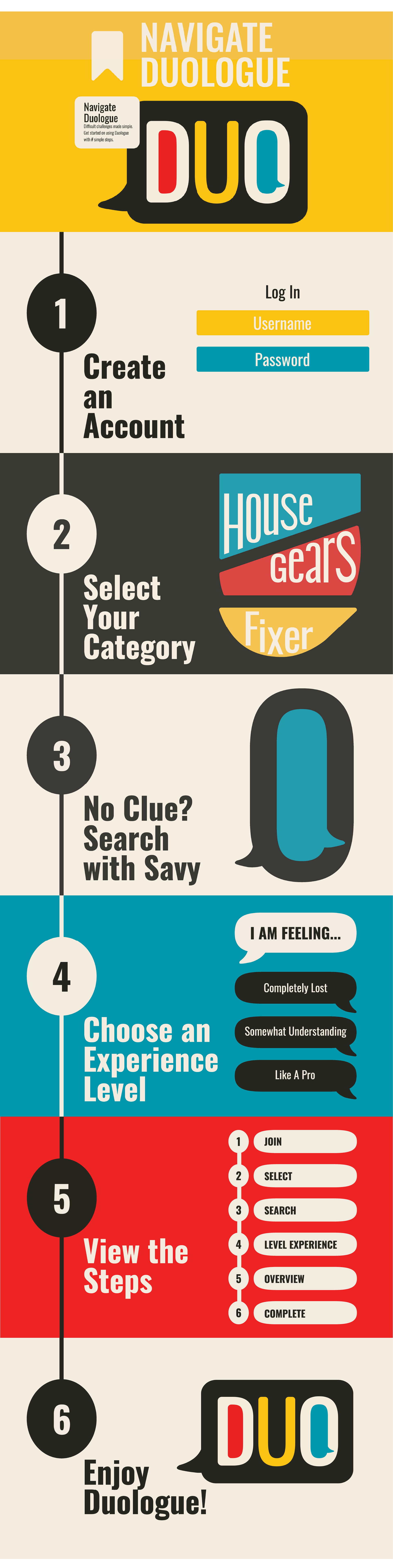
The initial steps of the streaming app were focused generally on assisting young adults who lack knowledge on carrying out tasks and providing forms of do-it-yourself projects. Thus with the naming, I began searching for synonyms and words pertaining to "DIY" and "home crafts." Out of the list of words I collected, one that stood out to us was the term, "DUOLOGUE."
Definition: (1) a conversation between two persons (2) a part of the script in which the speaking roles are limited to two actors.
Connection to our app: Rather than having it feel like you were taking directions from a scholar or an inhuman machine, we wanted to make the app feel personal as if talking to a friend or parent for help. "Duologue" in its nature, implies this human connection and back-and-forth conversation that still holds the function of guiding you through problems or tasks.
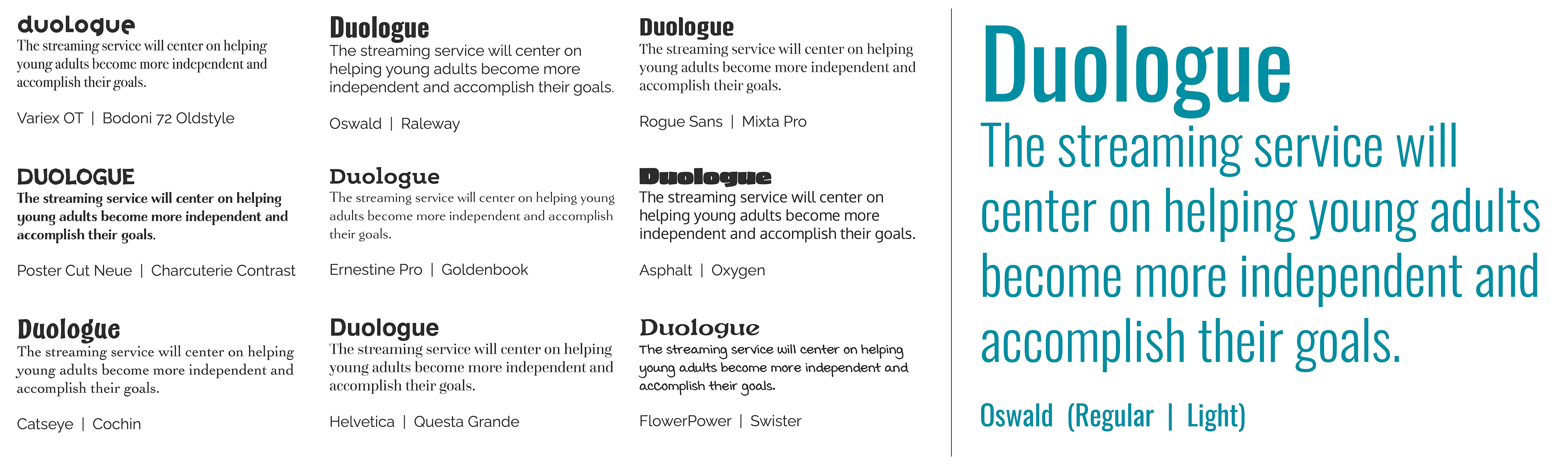
TYPEFACE EXPLORATION
Category Naming Exploration
Off of research and surveys, we narrowed the content of our app to focus on the following 3 categories.
1. Maintenance such as machinery and auto repair
2. Housekeeping including cleaning and laundry problems
3. DIY such as up-cycling and HANDS-ON projects
I searched for alternative naming conventions that could be used to give our app a lighter feel and more uniform while still getting the point across.
COLOR EXPLORATION
1. Initial Color Palette Idea
Kintsugi is the Japanese art of repairing broken pottery with lacquer mixed with gold or silver.
Similar to this style of pottery, our streaming app is focused on helping the user mend and fix their issues rather than discarding them and/or starting from scratch.
Similar to this style of pottery, our streaming app is focused on helping the user mend and fix their issues rather than discarding them and/or starting from scratch.
The color palette would be created out of two parts:
1. Lacquer Color: gold or silver
2. Additional Colors: The other colors, while up for suggestion, are inspired by the colors that create the original pottery base.
1. Lacquer Color: gold or silver
2. Additional Colors: The other colors, while up for suggestion, are inspired by the colors that create the original pottery base.
While this did not become our final color palette, the concept carried on into the visual design aspect of our project.
2. Identifying Competitor Color Palettes
Two main competitors that we assessed were Duolingo due to the name similarity and Ikea for its similar self-building mentality.
As we kept drifting into color options that were too similar to our competitors, I did a quick exploration of their color choices and found out that they were using color schemes that made their brands successfully stand out.
3. Color Exploration
Now understanding what made the competitor's color palettes successful, I explored alternative color schemes that we could use with a focus on looking at split complementary, analogous, and triadic color schemes.
For the colors, we wanted to go towards bright, saturated colors. As our competitors focused more on cooler tones, most of my exploration tried to lean toward warmer tones.
4. Final Color Palette
For the Final Color palette we decided on using a triadic color scheme.
These slightly altered primary colors are used to emphasize the “basics”. In our case, symbolizing the basics of learning.
having three main colors also would coincide with being able to differentiate between different sections of the app.

VISUAl EXPLORATION
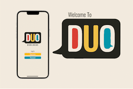
Mock Up
How To Navigate Duologue