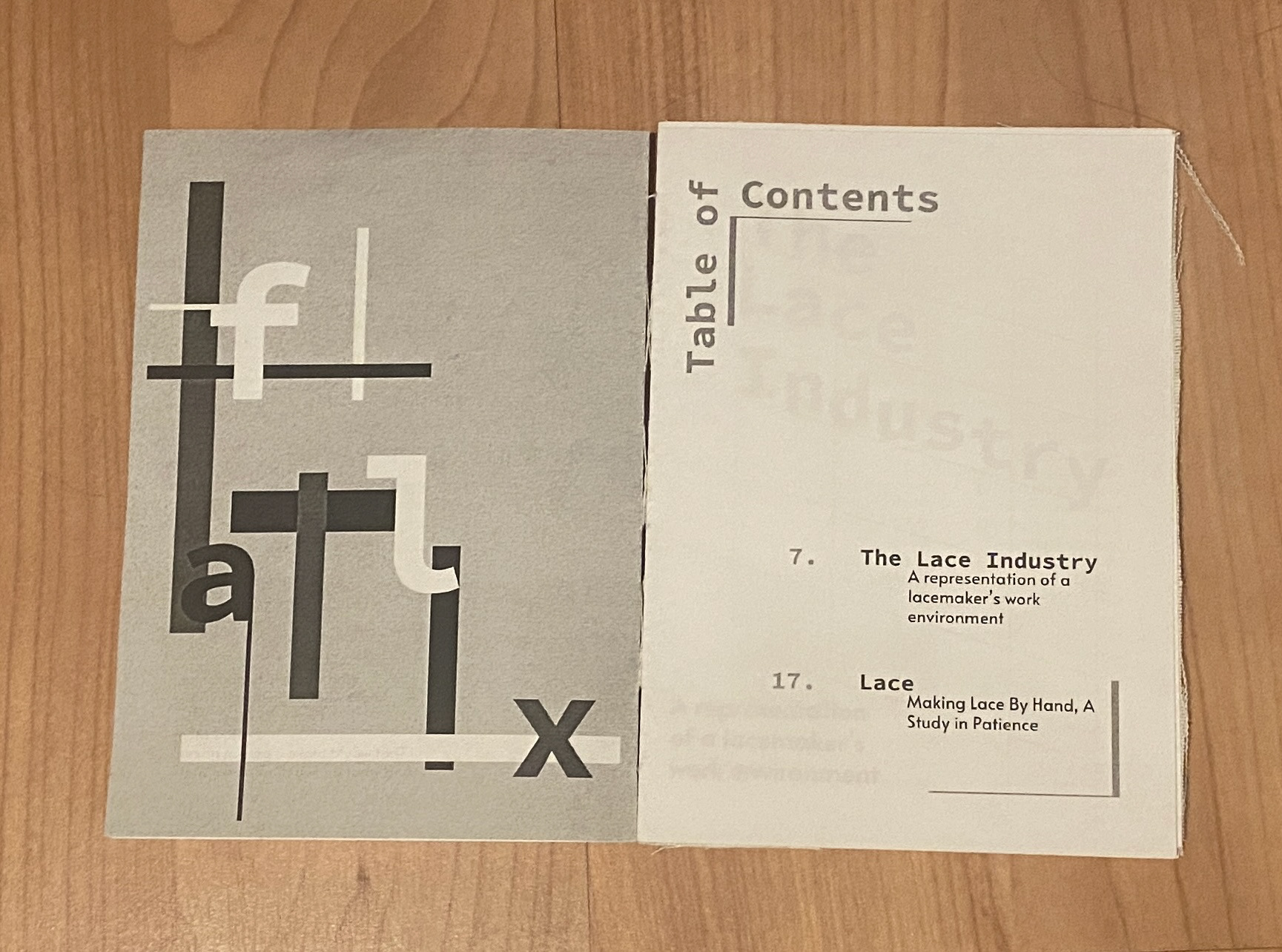
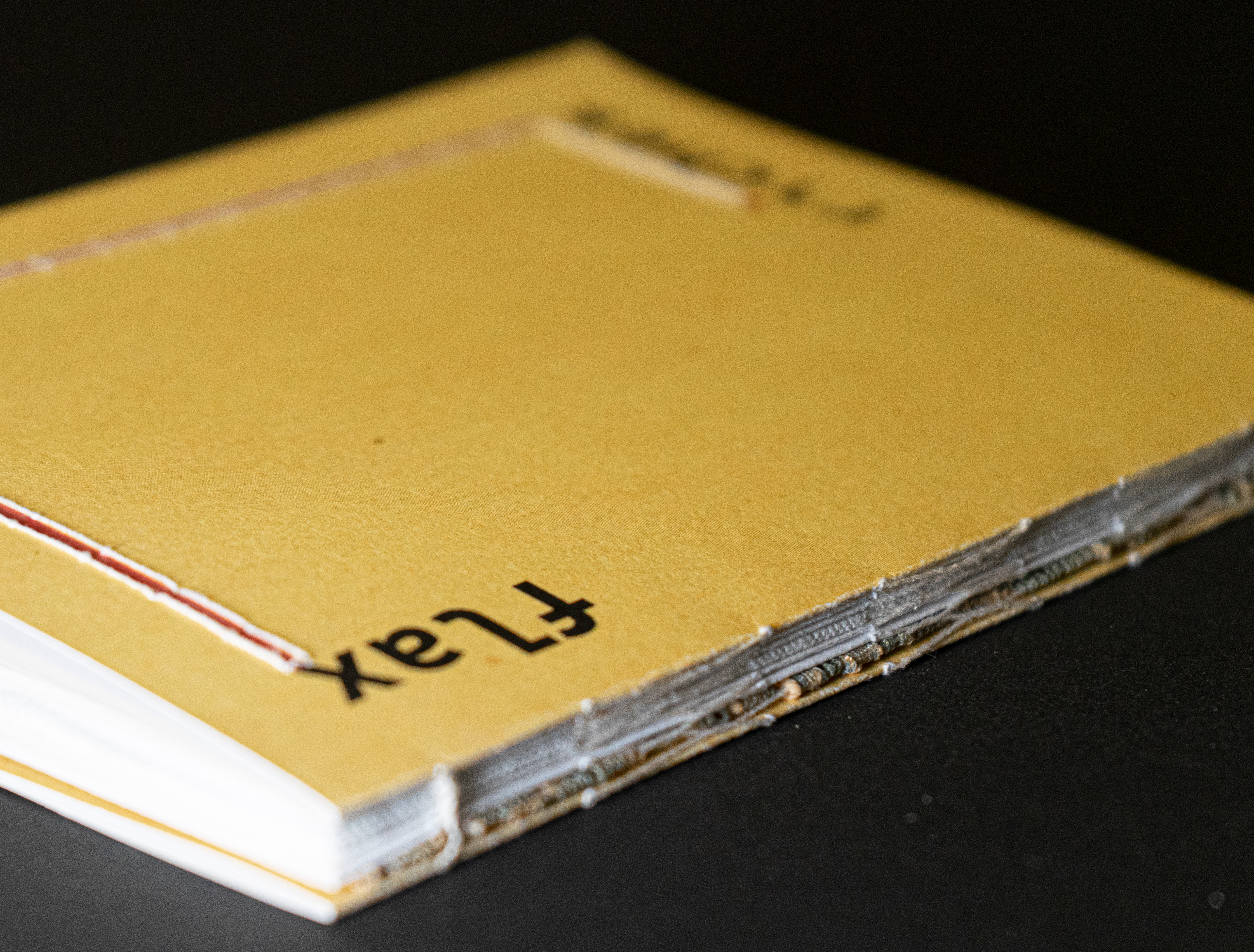
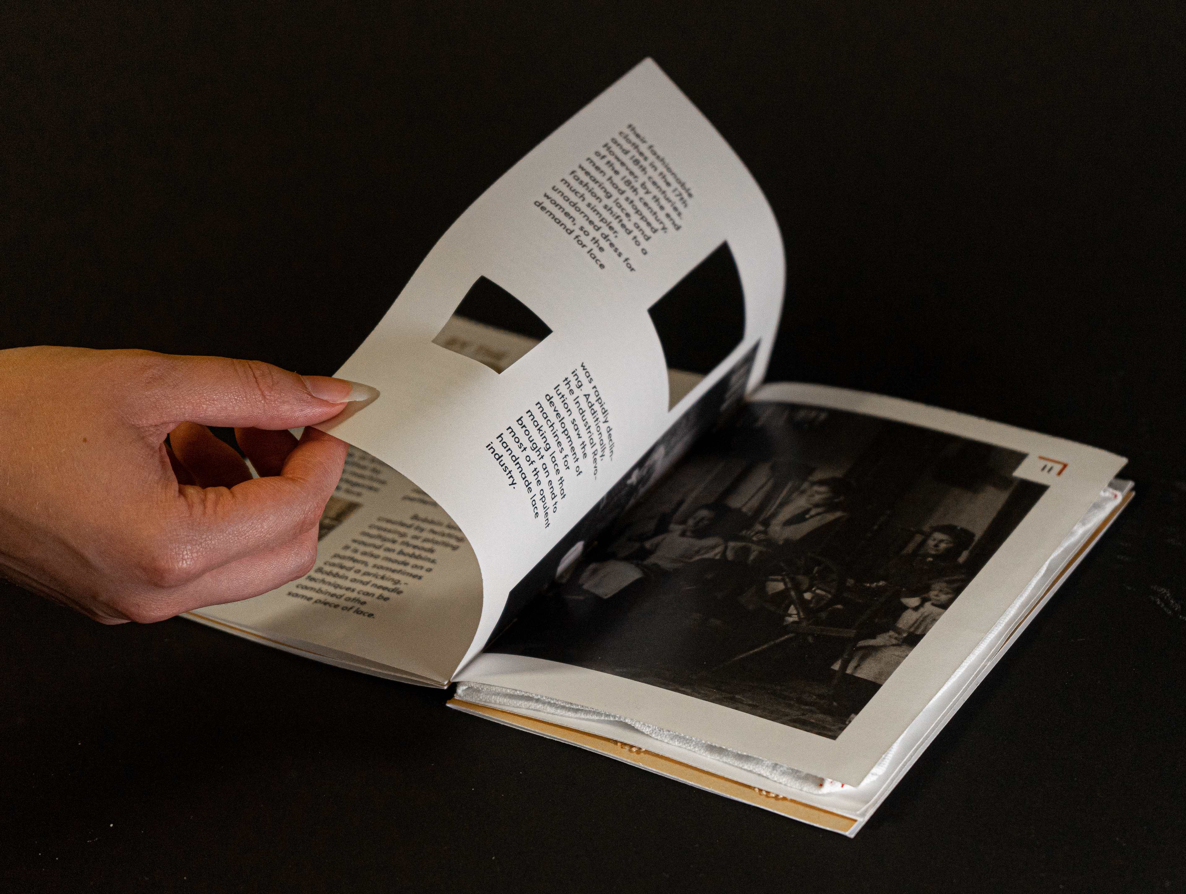
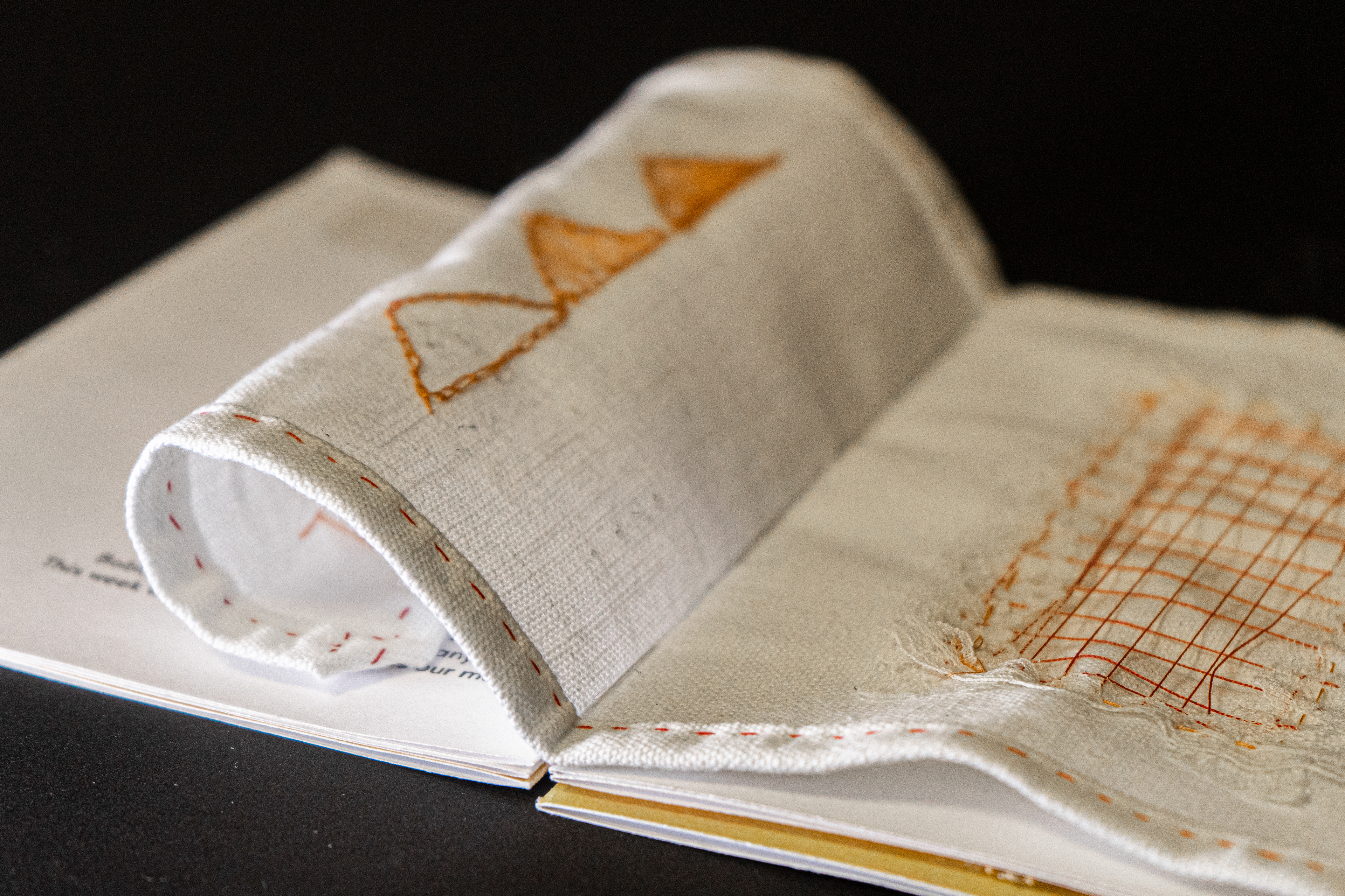
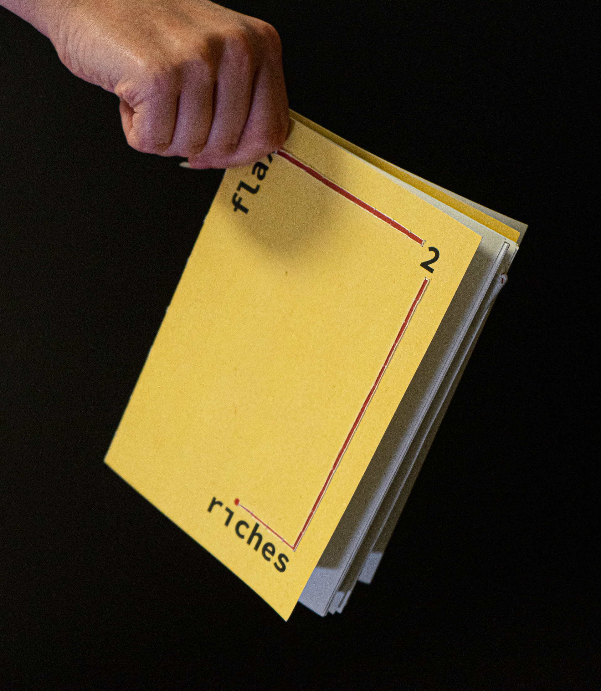
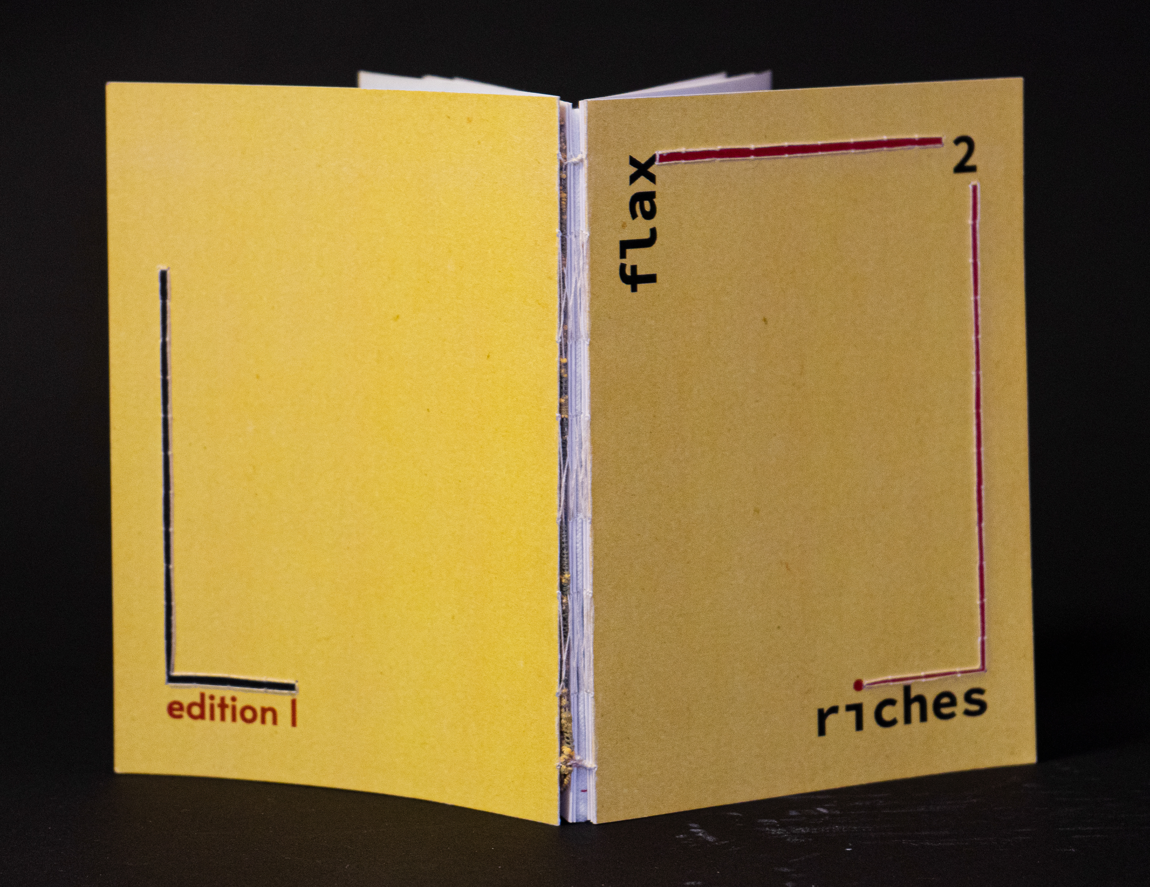
The final book is comprised of paper, fabric and lace pages. On the front and back cover, the line design is bordered with sewing to give it an extra level of texture whereas the cut out spaces and letters allow for partial reveals of images and pages.
PROJECT OBJECTIVE
For my final project in my Graphic Design Studio 1 class, I was tasked with creating a publication design for a cultural institution of my choice through the medium of either a digital or print format. As my personal goal was to create a physical and tactile book, I chose to focus on Texture: Museum of Flax and River Lys. This project challenged both my ability to design as well as time manage in order to complete a physical version of the published booklet.
Publication Logo Creation
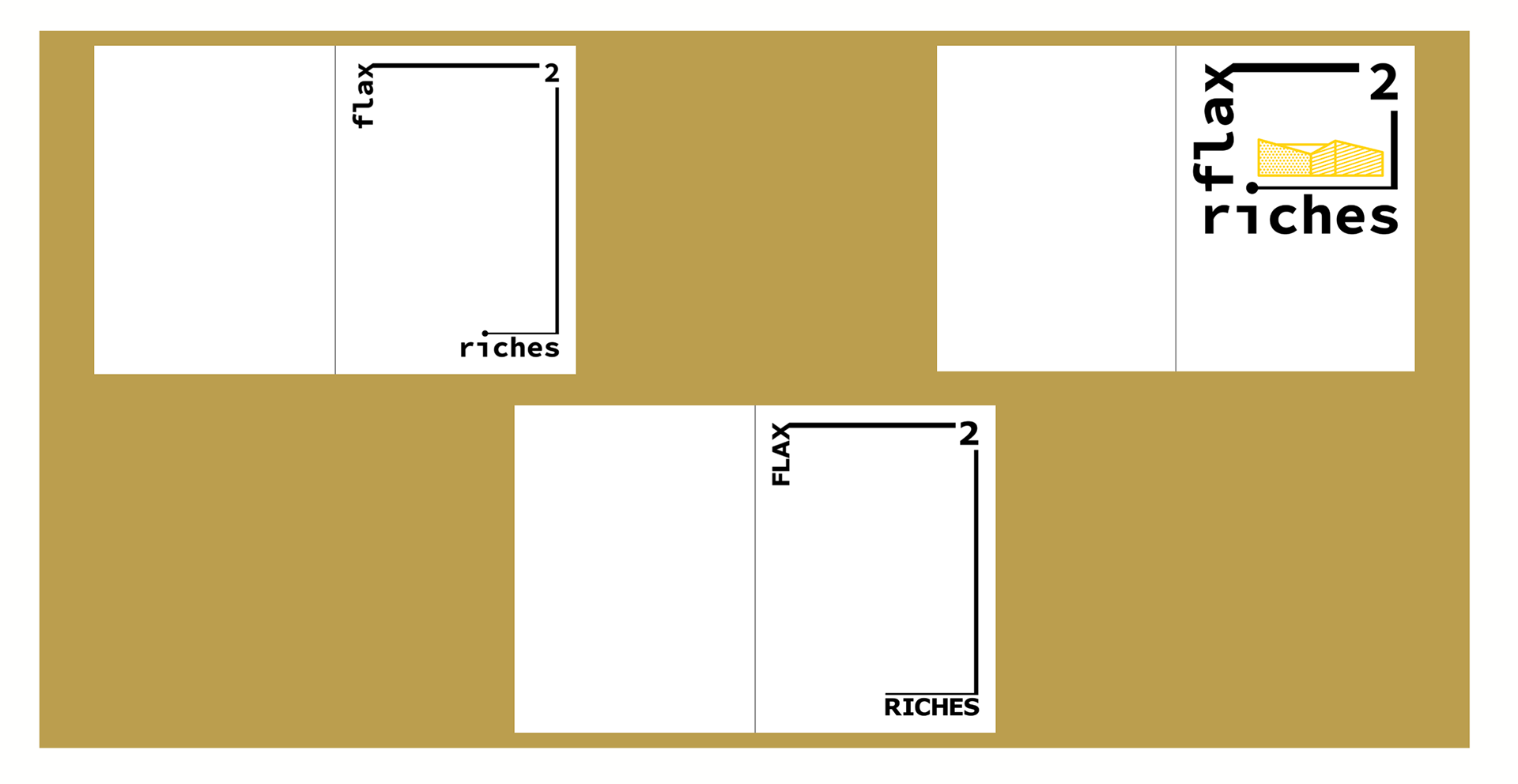
Beginning with the publication logo, I had several title ideas in mind. Not being familiar with museum logos, I tried out a wide variety of typefaces and design layouts, eventually landing on the title, "Flax 2 Riches".
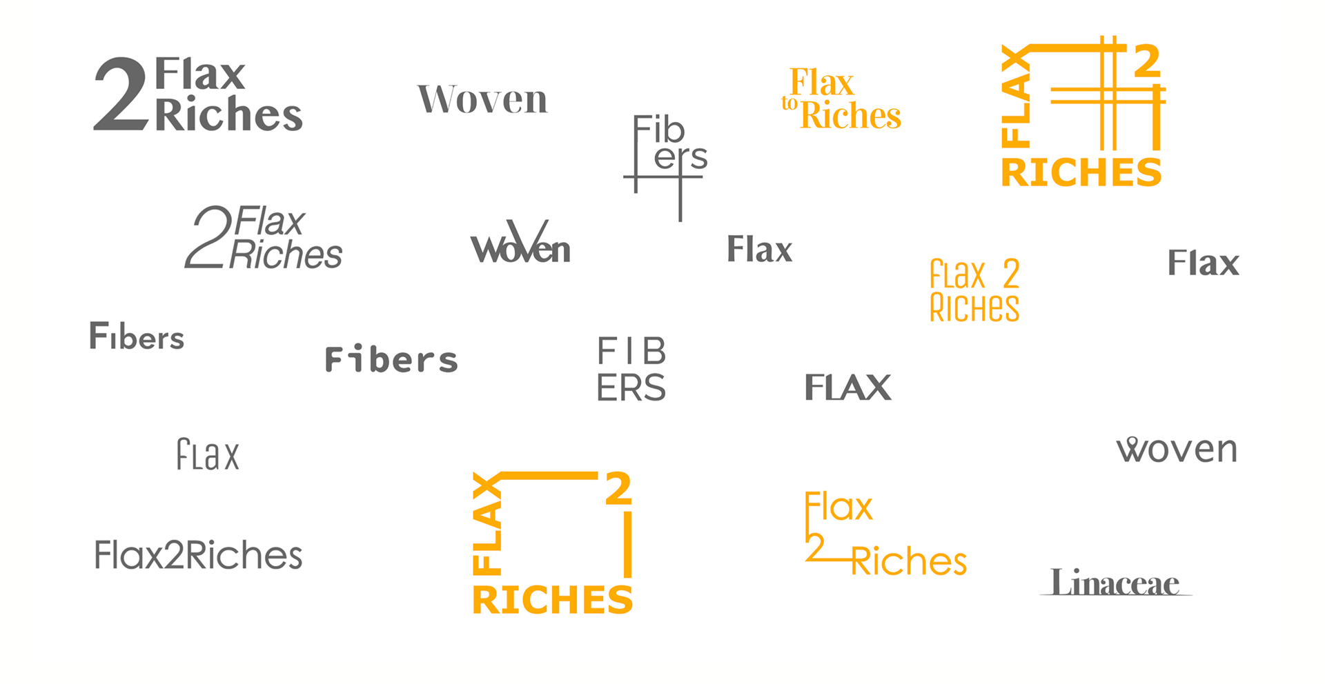
publication logo ideas
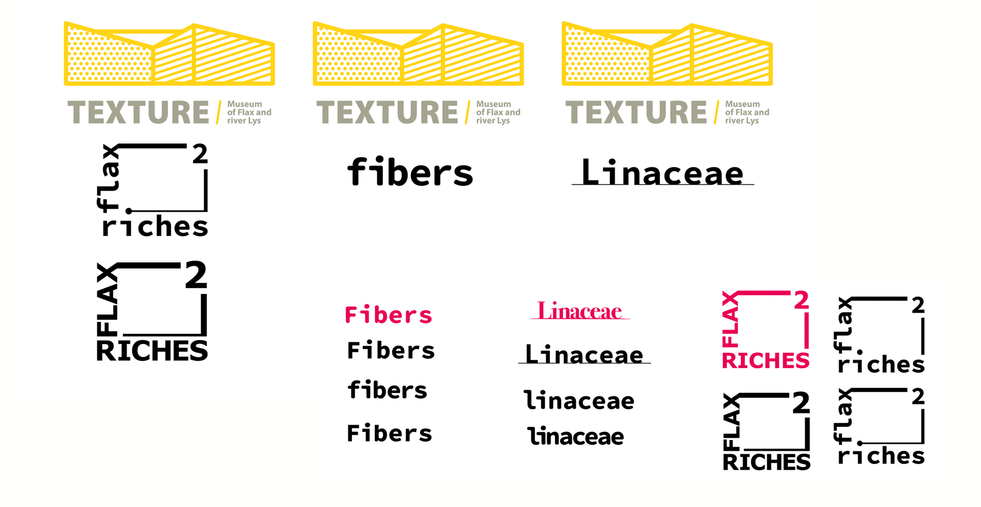
revised logo ideas with reference to museum logo
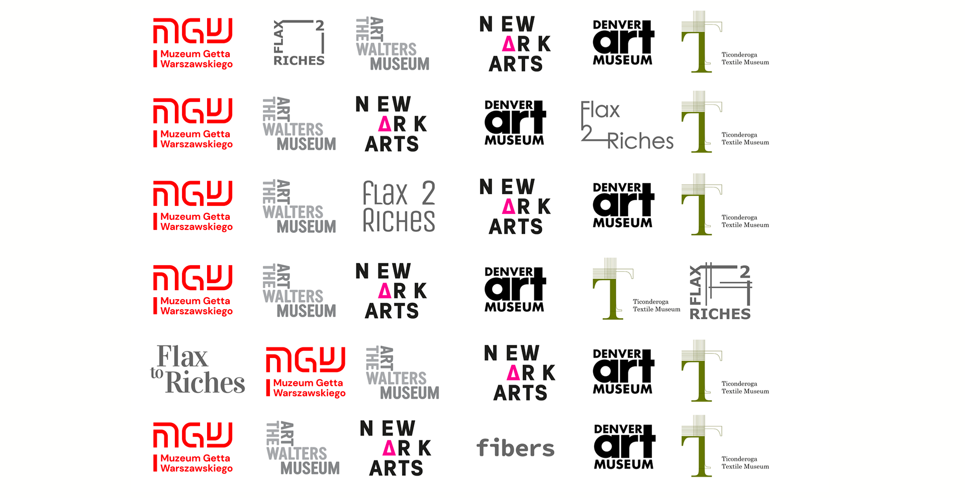
logos in comparison with other textile/art museum logos
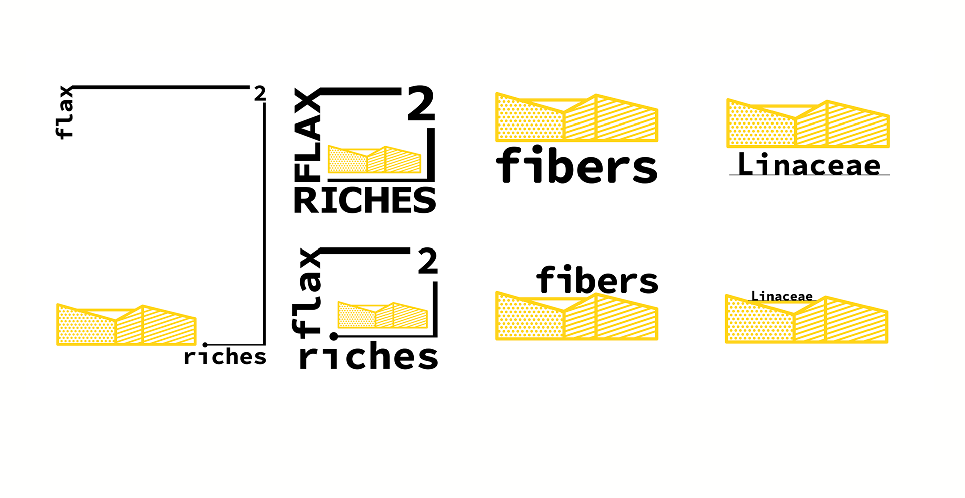
publication logo combined with museum logo
Sketches
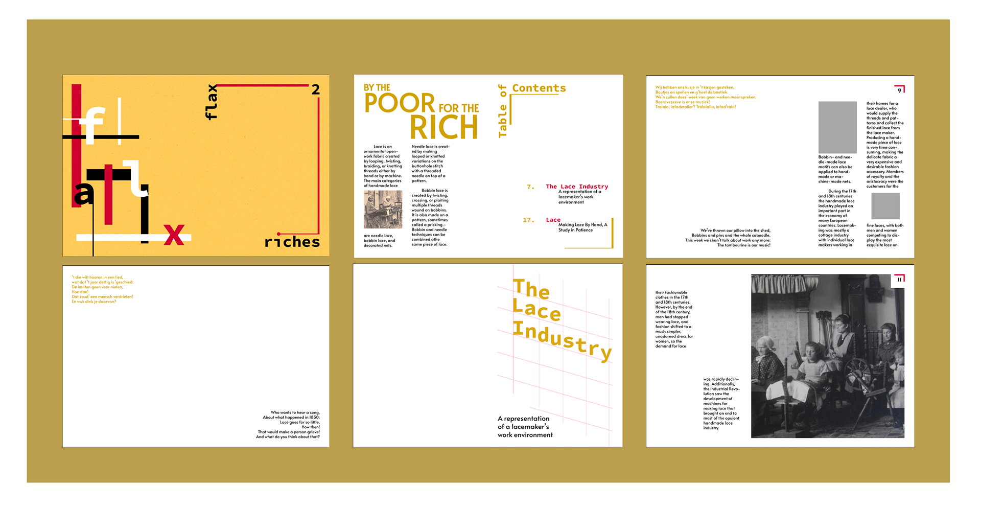
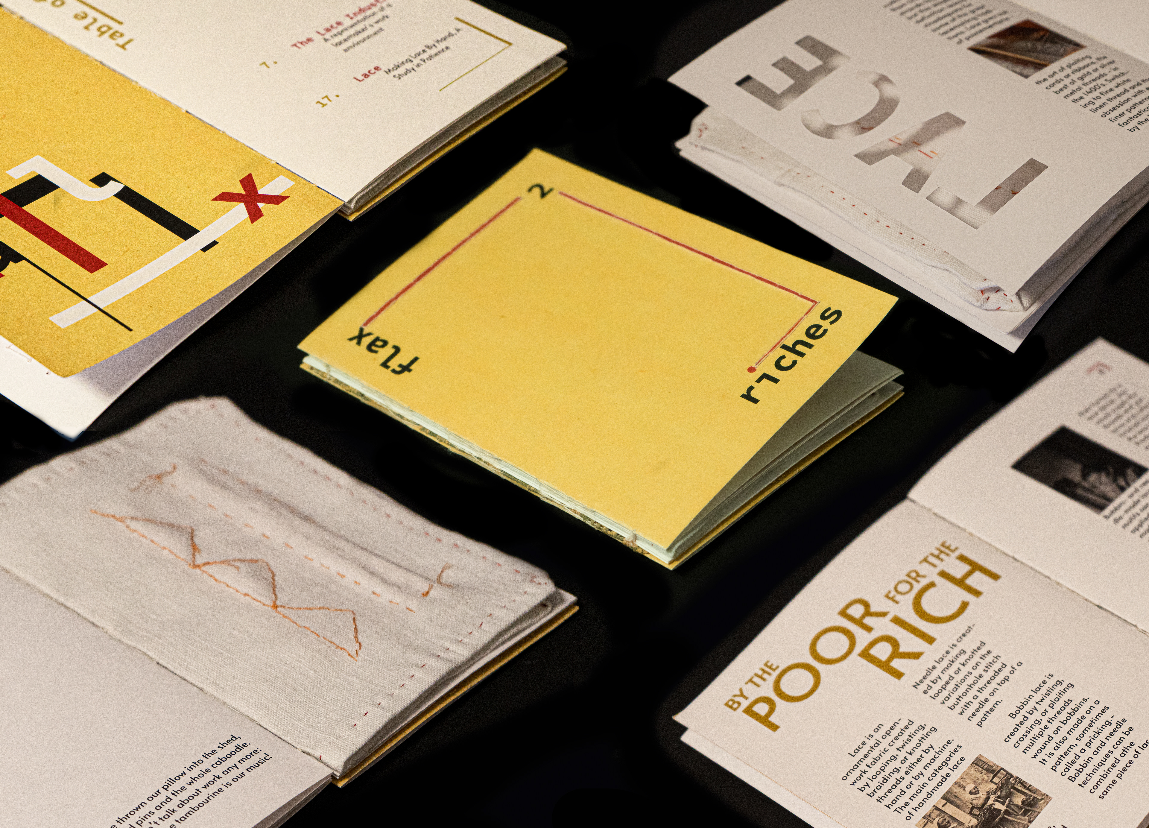
Within the publication book, I needed to include (1) a front and back cover page, (2) table of contents, (3) article introduction, (4) text heavy, (5) image heavy, and (6) project page. As my orignal plan was to make a physical book, I decided early on that I needed at least two articles (parts 3-6) in order to fill out and give my book more thickness. Thus, for my sketches, I created several different page layouts to have several options to chose from later on.
Along with the sketches, I began with my first mock up in order to see how certain layout choices would work later on in my process.


Digital Comps
I began digitally working on the design layouts. With the main set in stone idea being that the finished publication would be a small sized book, I had to be cautious of how many columns and my type sizes. I also focused on how the front and back pages would work when incorporating etched out sections (specifically the red, pink, and blue sections).
Front Cover
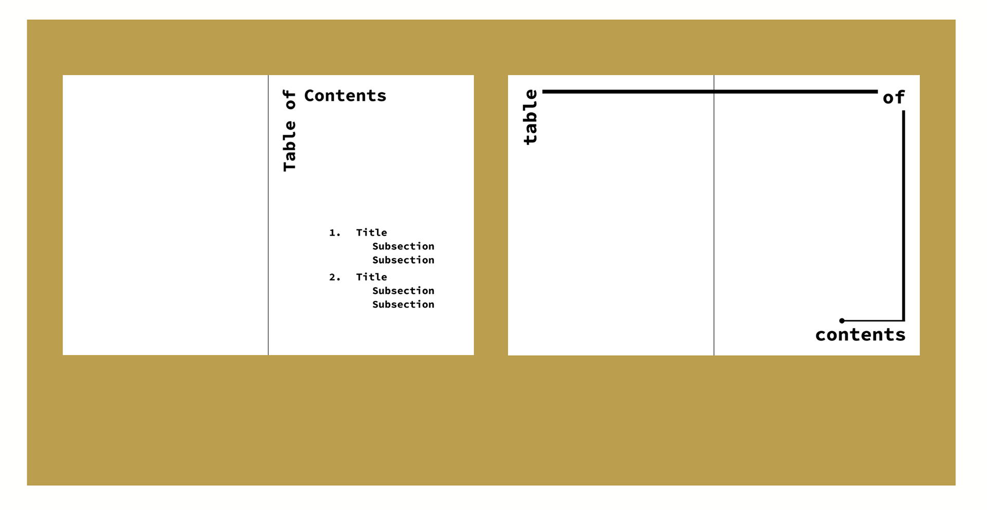
Table of Contents Page
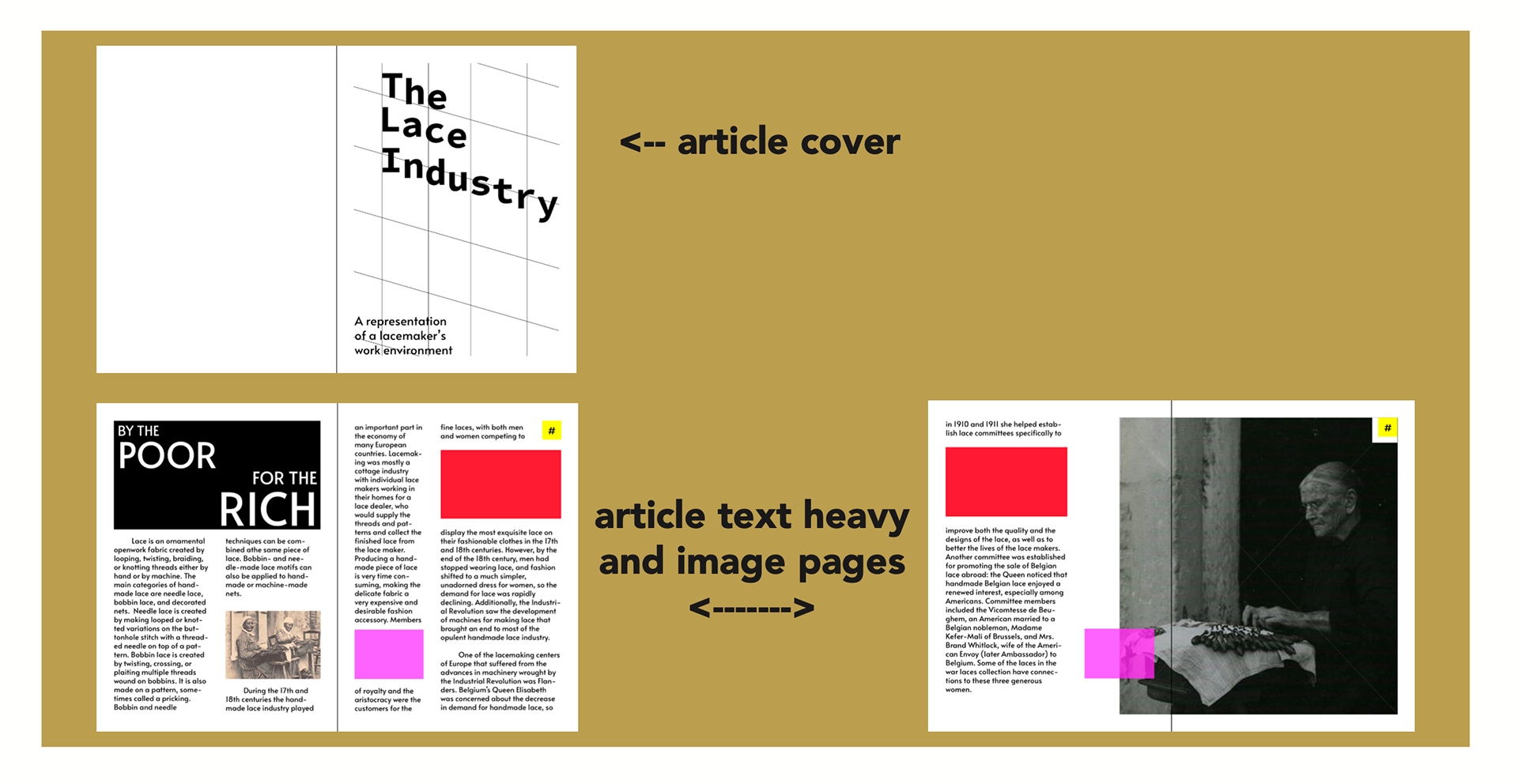
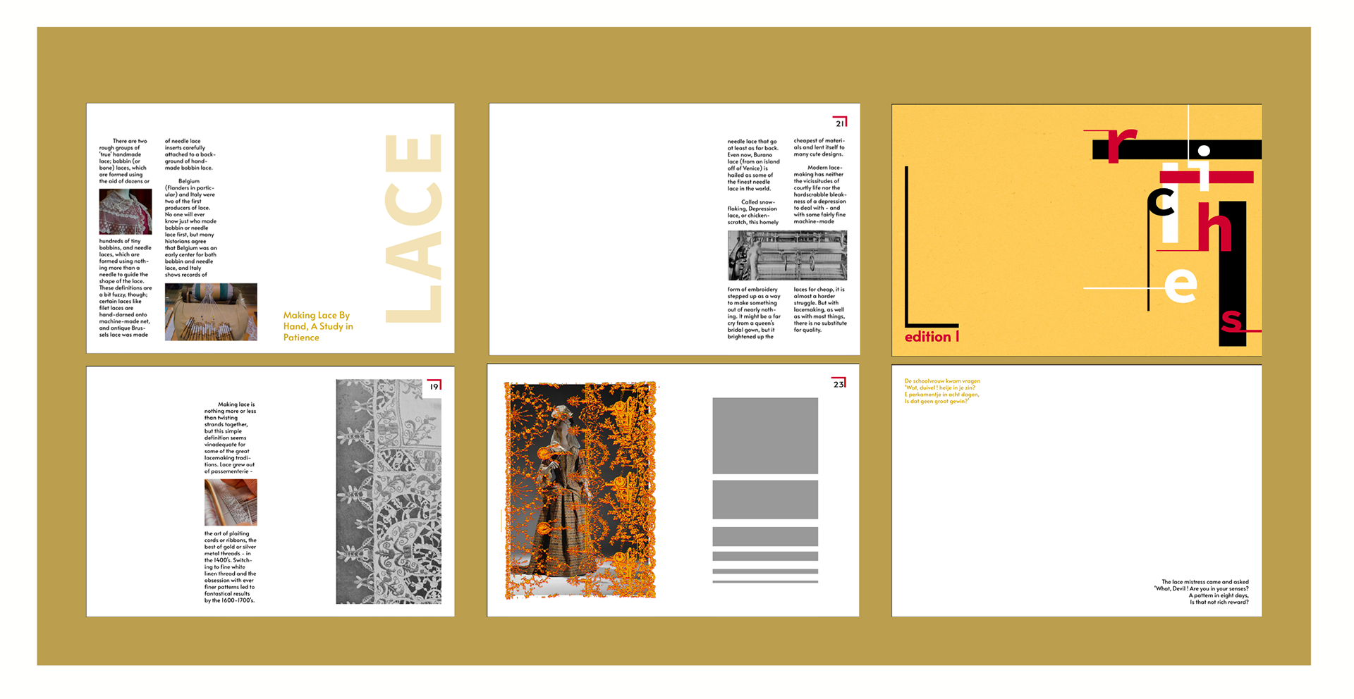
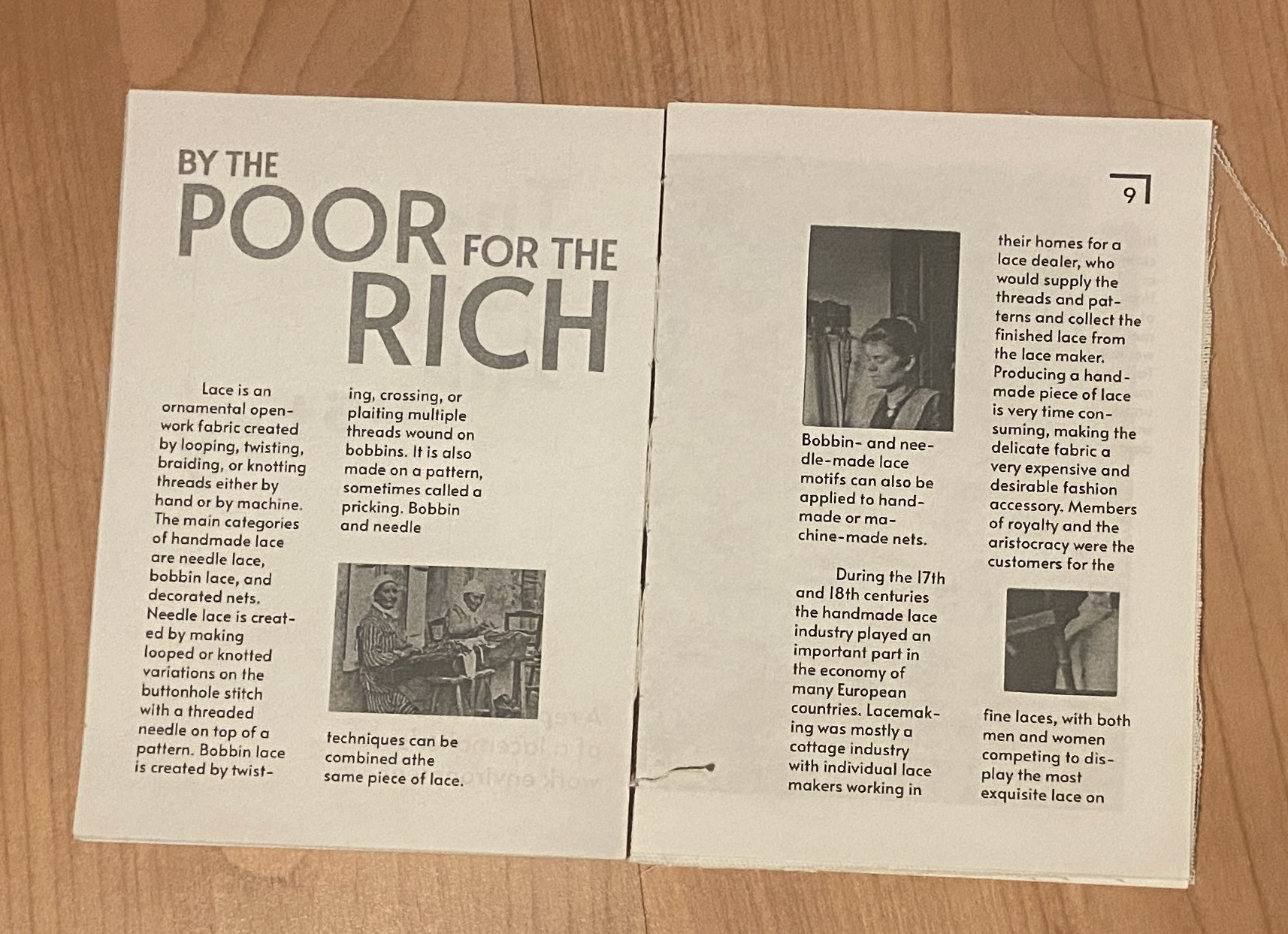
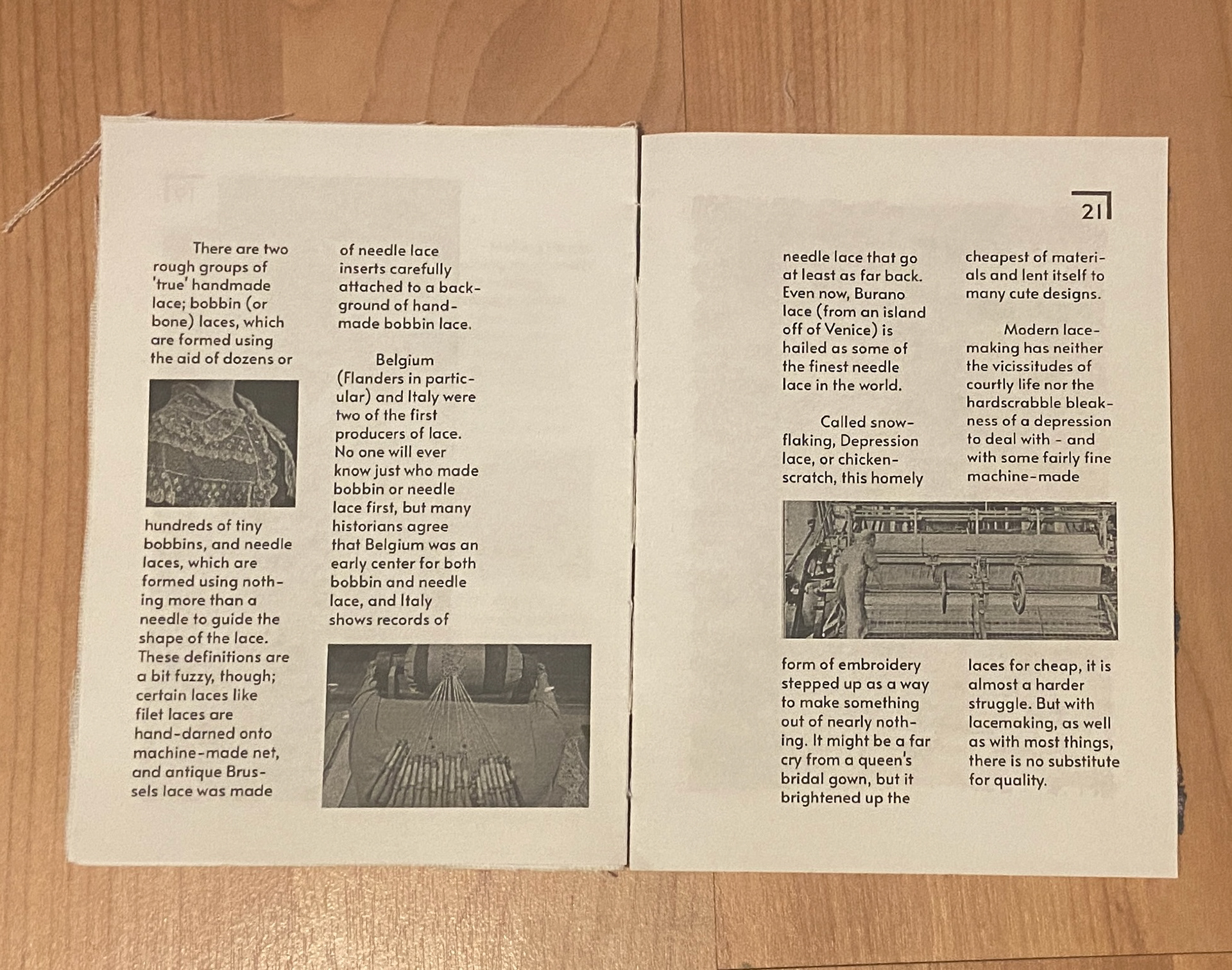
Article 1
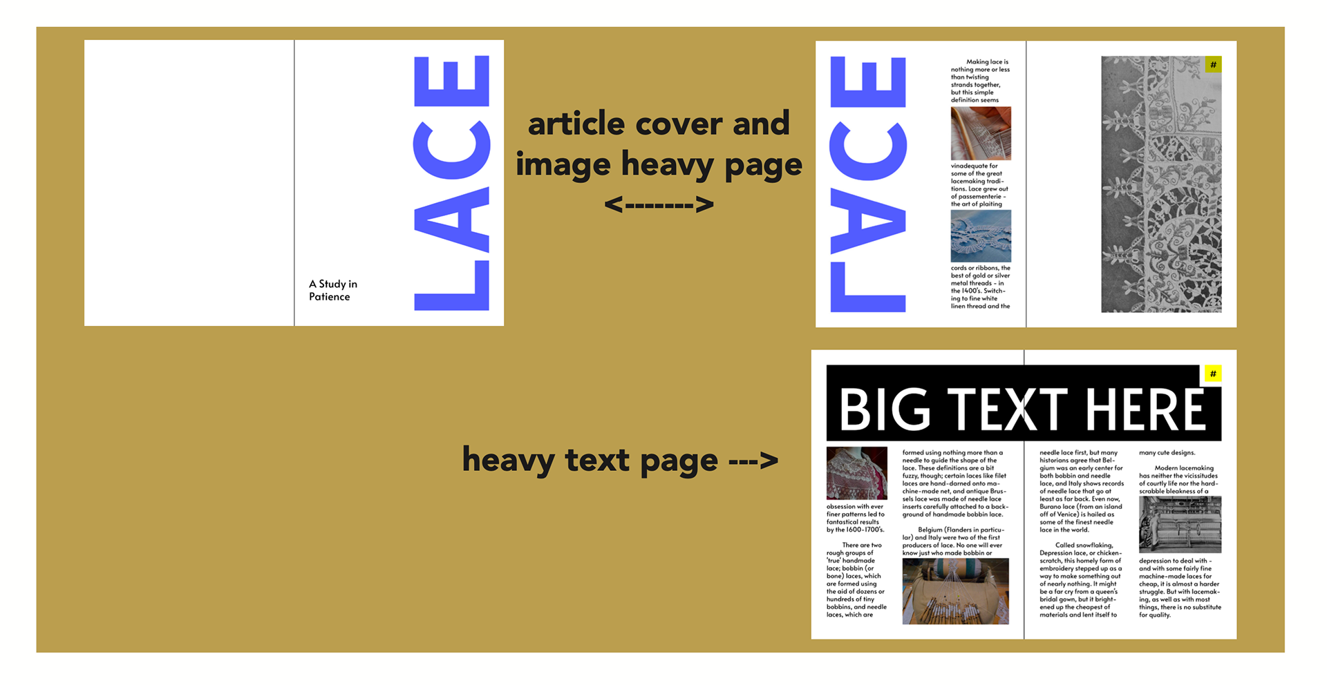
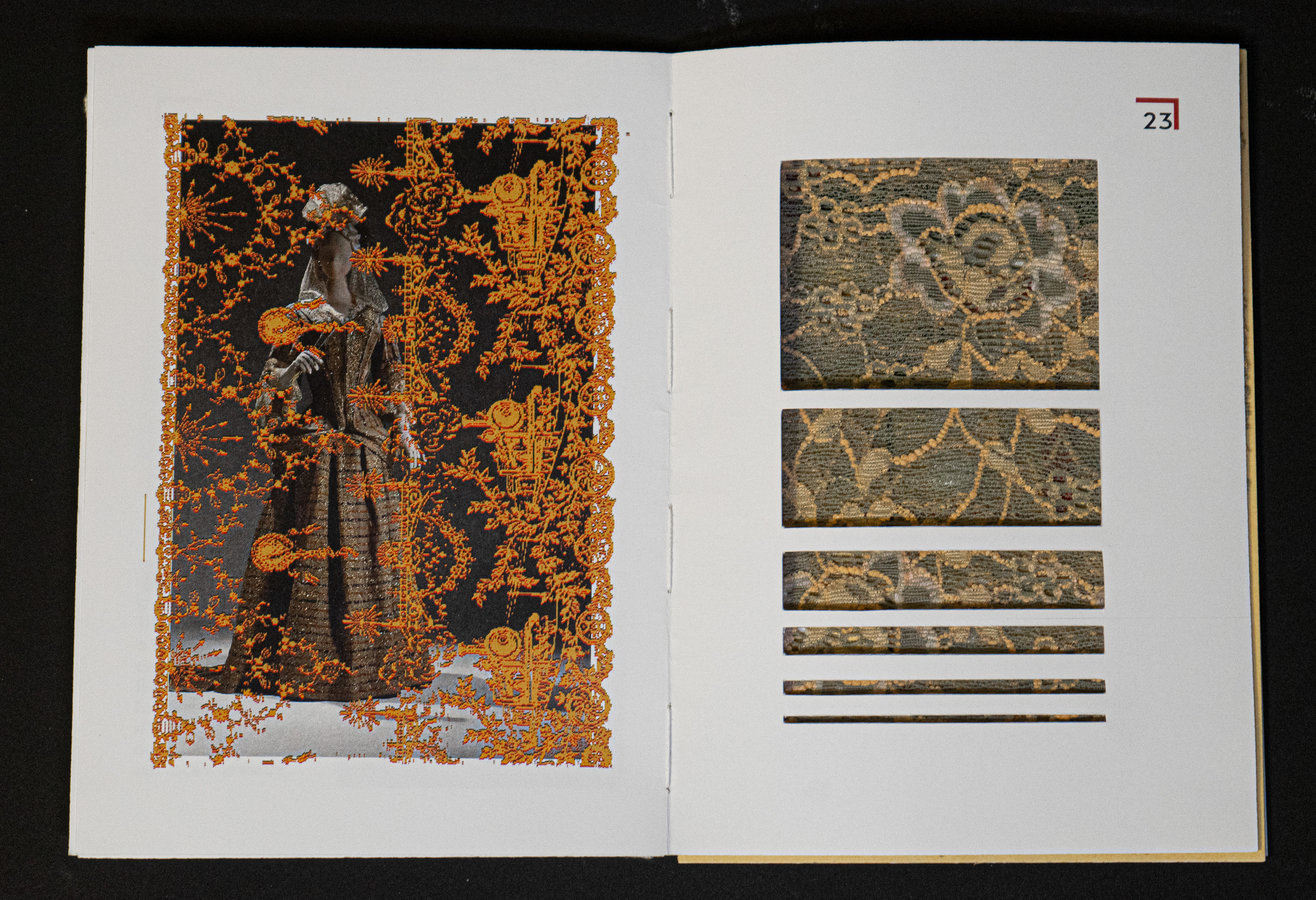
Article 2
Finalized Compositions
In my final page designs, I added in the idea of an inner design on the front and back covers to fill up the empty space due to how I would be binding the books. In the images bellow, the pages are laid out for printing purposes. Along with this section of my process, I printed out a mock up to make sure that the prints lined up properly before creating my final product.